Rethinking Black in Digital Design: Embrace the Near-Blacks
When working in digital media, it's easy to default to using pure black (#000000) — it's bold, it's dramatic, and it's everywhere. But here's the thing: pure black can often feel harsh, flat, and lifeless, especially on digital screens where light and color play a huge role in how a design is perceived.
As a designer, I’m not opposed to using pure black — it has its place. But more often than not, especially in modern UI and branding work, subtlety wins. Instead of reaching for true black, consider exploring deep, near-black tones that bring warmth, depth, and harmony to your work.
Why Avoid Pure Black in Digital Design?
On a printed page, black can be rich and velvety. But on screens?
It can feel unnaturally stark.
It may create eye strain, especially in large areas.
It often lacks the temperature and depth that colors carry.
Digital design thrives on nuance, and true black often bulldozes over the more refined tones of your palette.
Color Theory in Action: Near-Black Alternatives
These aren't just “almost black” colors — they’re rich, moody shades that evoke emotion, create contrast, and add dimensionality to your design:
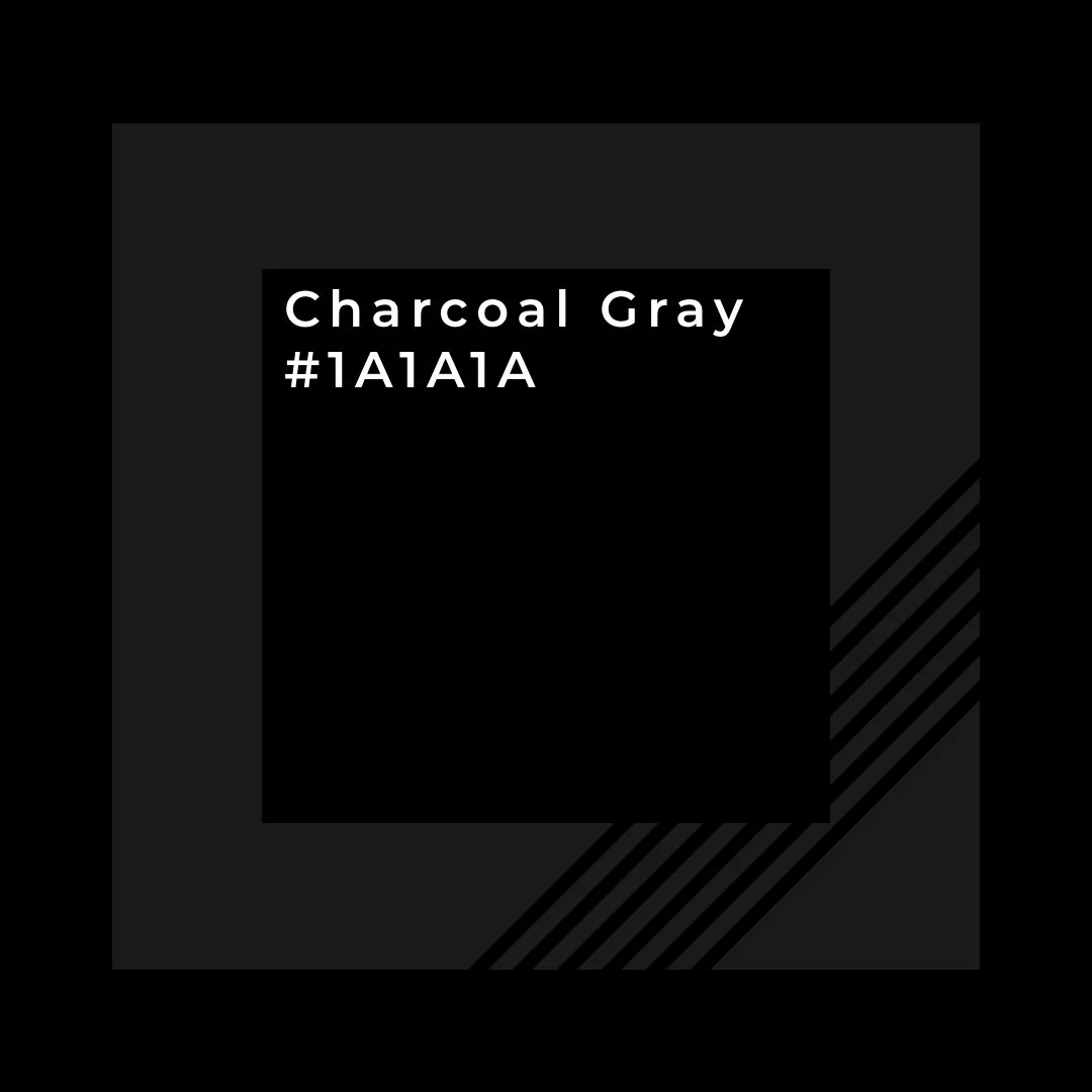
Charcoal Gray – #1A1A1A
A neutral go-to for body text or dark mode backgrounds. Softens the feel of a design without losing impact.
Raisin Black – #231F20
A warm, purplish-black tone that feels luxe and editorial. Perfect for fashion, beauty, or moody brand aesthetics.
Rich Navy – #0A1E2E
Cool and professional. A fantastic alternative for tech brands, app UIs, and anything modern or minimalist.
When Does True Black Still Make Sense?
There are times when pure black is the right choice:
Print materials like rich matte business cards or packaging.
Text-heavy documents meant for e-readers or accessibility devices.
Designs intended for OLED screens, where true black pixels actually turn off for battery saving and high contrast.
It all comes down to intent. Ask yourself:
What device is this being viewed on?
What emotion am I trying to evoke?
Will this black support or overpower the surrounding palette?
Final Thoughts
Design isn’t just about what’s visible — it’s about what’s felt. The colors you choose, even the darkest ones, carry emotion and purpose. Near-black tones are your secret weapon for creating refined, beautiful, and user-friendly designs in the digital space.
So next time you reach for black, try something close — and watch your work come to life.


